![]()
Are you designing in 2016, make sure you read this guide before doing so. This guide includes 4 simple yet critical aspects to design an emphatic logo design. Logo designing is never easy. You have to include every bit of information of your client’s company within the boundaries of being simple, attractive and unique. Logo designing is a serious matter perhaps it it the first impression a brand lasts on its consumer.
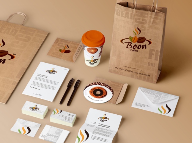
It is a sensitive issue to design a corporate identity of a company or a business. It requires handsome amount of experience in the particular field and a vibrant mind with ideas bursting. So its quite clear that a logo design is not just a molded shape in colors but it much much more than that.
With all this said let’s focus on what are the trendy logo design hacks we have for the year 2016. These tips will help you develop a trendy logo design in 2016.
1: A WOW Factor:
If you are firm in simply getting a logo right, you are too static and not dynamic – which is hence the requirement of having a logo that is emphatic and appealing. Be creative about it, think outside the box but don’t get carried away. Make fixes that you think are to be fixed before this design goes on board.
2: The Rule of KISS – Keep it Simple Silly!
We are crowded with logos all day. What’s necessary is of creating something that is simple, silly and straight that is to the point. What necessary is that your point becomes clear and you say what you want to from the graphics.
3: Versatility:
A logo design should be such that it looks perfect just about anywhere – be it on the website, or a poster. Make sure that your logo is not restricted to a color.
4: Uniqueness:
This is perhaps the most important of them all. Copying is not good, planting your very own seed and watch until it grows into a tree sure is. Therefore, take your ideas and make the most out it. Make sure the final product is your creation for a logo design represents your crafty nature.